

Apples visual style, known the World over, could have a negative impact moving forwards.
Their trademark style is actually both minimal, and cluttered in my opinion. The minimal side of their branding and design thinking is clear, foremost in their product design, and secondly their web presence. Minimal and clean is the simplest way describe it, I won’t go into too much detail in this post. Go to www.apple.com. for a quick browse, but I’d be shocked if you are not already familiar with Apple. A simple layout with no visual clutter. minimal use of colour. A large focal shot of their latest product dominates the page.
Apples iOS, on the other hand, has a very set style. Heavy graphics, bevels, shaded icons with rounded corners. It again is all very familiar, but perhaps after 5+ years the design is becoming a bit dated, and changes very little visually with each release.
Apple seem to have a different, more flexible approach with iPod advertisement, which is in stark contrast to their other products. Colorful, loud and eye catching, which fits the purpose for selling an personal music device. Take a look at any of Apple’s promotional videos or television advertisements for iPhone or iPod however and you will see their trademark approach. A minimal white background, with simple product shots, which has long been a visual style used by Apple, and gives brand recognition the world over.
It is this familiarity that is perhaps becoming stale. The visuals for Apples products are expected to look a certain way. From television advertisements, packaging all the way through to button drop shadows in their operating systems.
Skeuomorphism
Skeuomorphism is the practice of trying to replicate a texture or material from the real world in a different environment, in this instance, software. Lets look at an example. In OS X Mountain Lion, Apple updated the iCal Application. The Graphical User Interface (GUI) was updated to mimic a leather bound printed diary. Attractive? I think not, but as to every argument, there are two sides.
Skeuomorphism is generally considered a positive thing due to familiarity with the interface. Mimicking the visual style of a real world object that everybody has used, a printed calendar for example, will instill confidence in the user. They will feel comfortable using it.

Arguments against this practice of visual ornamentation of software generally focus around the relevance of replicating a real world object. If it does not add anything to the functionality, or user experience, then it is not required. Screen space is valuable, and mocking up a leather surface is superfluous. In the case of iCal, it does not add to the user experience, and doesn’t even manage to be aesthetically pleasing. It is ugly. The version before was visually cleaner. If it isn’t broke, don’t fix it.
Should you need more convincing regarding Apples love of Skeuomorphism, Notes is another example.
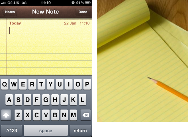
It attempts to replicate a tangible notepad, and even uses a casual script font to loving recreate a hand written feel. The problem is, as a user, I am not using a pencil, or writing on paper. I am using my iPhone, and I am fully aware of this. If wanted to use paper, I would do so. We are not yet living in a post apocalyptic water world where paper is as valuable as Gold.
The digital world is mature enough now, and Skeuomorphism is an outdated practice. Users know they are using software, and in my opinion its almost patronising to think they need to be reminded of the physical counterpart. Of course this opinion is subjective, as its based primarily on styling, not function.
Pigeonholed
I think Apple have placed themselves in a rather tricky situation. Their huge userbase expects their operating system on their iPhone to look a certain way. Through their ridged approach, they have laid down a design standard, which set the bar high, albeit 5 years ago.
Apple designers now have their hands tied. Android had a massive overhaul of their operating system visual design with the introduction of the Holo theme, rolled out with Android 4.0 (Ice Cream Sandwich).
The Holo theme is minimal, fresh and contemporary. It also allows Google a level of consistency they did not have before, something in which Apple, historically, have always been ahead of the game.
If we take a look at the Stopwatch Application on both platforms as an example, we can see from Apple the same old heavy gradients and bevelled buttons we have come to expect from Apple iOS.

The Android equivalent, on the other hand, is fresh and modern. Again purely subjective, but I think it is the rigidness of Apple that will prevent them from progressing with design on a visual basis. It looks old, because it is old.
Be Bold
Windows 8 is another perfect example of perhaps a Revolution opposed to an Evolution.
Microsoft like to play it safe. But they realised the future of PC, Tablet & Desktop, and Windows 8 was born out of the need for one solution to stretch across all platforms, and in my opinion, responded with a visually bold solution, perhaps unexpected from Microsoft.
Apple need to somehow become more flexible, or risk becoming more stale than they are already. Apple need to bold, not safe.


2 Comments
bobby
Easy to slam now that the world have finally caught up. Share prices in Apple have tumbled recently amongst fears that their innovation has slowed down wiping $50 billion off their company value.
Microsoft have just had a good stab at the interface war but I guess that was a misfire given what people are saying.
Iain
That’s true Bobby, I’m an avid Apple user, although your point about Apples share prices sure reinforces the fact that it’s time for change. My article was not really intended to cover Apples business model as a whole, though. I’m looking at the UI design, which rather than catching up with Apple, perhaps the rest of the world are beginning to surpass them. Which is a shame given where they were 3-4 years ago.