Exploring the use of multi-touch gestures in Application design
Gestures are nothing new and have been around since the smart phone was invented, in fact way before that. Take military air personnel using hand and body gestures to direct flights aboard aircraft carriers for example. Gesture based interaction with digital media has taken a leap forward with Microsoft Kinnect for xBox, where the users body becomes the controller.
But the focus of this article is to determine how useful gestures are in terms of interaction with Applications designed for your smart phone or tablet. Lets take a look at the definition of a gesture. ‘A gesture is a form of non-verbal communication in which visible bodily actions communicate particular messages’. So in terms of interaction with an Phone Application, that is a specific user action, with their fingers in this instance, which the Phone can interpret, and take the appropriate action allocated to the gesture. Simple enough.
The smart phone can interpret a basic set of gestures we are all familiar with, Tap, Swipe, Zoom etc. Multiple variations on these themes can also be incorporated, double tap, fast swipe for example. It is down to the designer to decide which gestures are to be used, and for what purpose. I want to question how useful, in terms of usability, gesture based interaction is, and how much we rely on it.
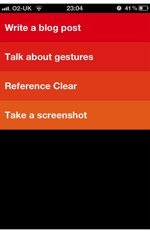
Lets look at an example. An application was released a while ago called ‘Clear’. It caused quite a stir in the digital design & development world, for a couple of reasons. First, the minimalistic interface. It couldn’t be anymore minimal, as the screenshot below demonstrates.

Secondly, it relies exclusively on gesture based interaction. With no navigation bar, buttons or any other traditional GUI elements, it really is a case function over form. Or is it? One thing you will notice is that when you download the application and launch for the first time, you are presented with a tutorial. This is all well and good, but you could argue that an application this simple should not require a tutorial, it should intuitive enough not to need one. It’s a todo list application, not an Apache Attack Helicopter. The developers Website states:
‘With its beautiful interface, and gestural interactions you already know how to use, it’s the future of todo lists.’
This statement is true, you do know how to use the gestures already if you own a smart phone. But you don’t know what the gestures do contextually within the application, you have to learn. What make this process difficult is the unnatural gesture assignment to the given action. Take a magazine style application. A swipe might turn the page, Flipboard is a good example. The swipe gesture mimics a physical page turn, which feels natural, with no memory required. Gestures which don’t map to a natural action are hard to remember. For example pulling up on your list clears out all the crossed off items, which even through exploring various gestures, is far from obvious.
Now I don’t want to come across as negative towards Clear, I like the Application very much and use it myself. I chose to focus on it because its brave, and it does what it was designed for very well.
An argument I have heard several times is that gestures make using the application faster, and therefore more efficient. I don’t think anybody can argue that a swipe takes the same amount of time as tap. So in context, a left swipe is no more efficient than tapping back. Some gestures are perfect for certain tasks. Pinch to zoom works perfectly in any given situation. Manipulation of an object, such as a map, using gestures feels natural and adds to the user experience.
Gestures should not be used with a ‘Because we can’ attitude. This threatens to alienate users, and as designers, we should ensure the end user experience is as simple & intuitive as possible. With that said, Clear is fun to use when you get the hang of it. A middle ground must be adhered to, and some assumptions must be made on the user. Too many gestures and they may become superfluous to the user experience, and nobody likes fluff.


2 Comments
Cem
Something for you to think about, having used Siri on iPhone 5, is it possible that speech interaction is becoming so competent that it may make redundant any ‘touch’ based input?
As impressive as Minority Report based input mechanisms are, it does look very fatiguing and I suspect an 8 hour day at the office would have you aching at the arms before long, where as we all know, your vocal chords can carry on for hours. Sometimes days….
Iain
Ha, yeah good point. I would never imagine a desktop touch screen interface would take off. Kinnect is popular in the home as it’s the first widely available example of the technology.
I would highlight that an office with 100 people all talking to their computers would be chaos. Conference phone calls would also be impossible. So again, not relevant for an office senario I think.