
Apple has just announced the pending release of its most recent operating system– iOS 8. We got a preview of the new system and did a side-by-side comparison between iOS 7 and iOS 8 with our iPhones here in the office. The update includes so many new features that it would be hard to tackle them all, so we have included the ones we think users are most likely to find helpful, and our thoughts on them from a usability standpoint.
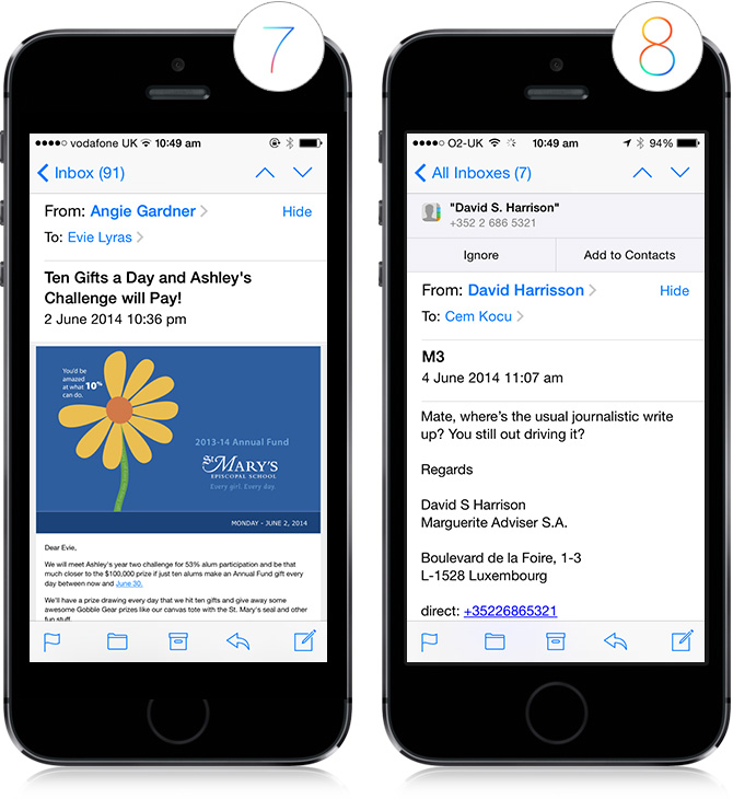
When receiving an email from a new contact, iOS 8 has the option to “Add to Contacts” or “Ignore” storing the person to your Contacts within the context of the email. This appears in the form of a static banner and includes all of the sender’s contact information clearly visible at the top so that you can see everything you would be adding to your Contacts list without having to undertake a single action.
As some of us at demoMedia are iOS users ourselves, we find it helpful when a single display includes all necessary information for us to make an informed decision, but we can’t help but wonder if the typical user is interested to know the sender of an email’s phone number within the context of email communication. Perhaps this is a step towards the integration of all mediums of contact.
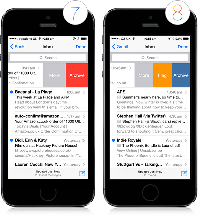
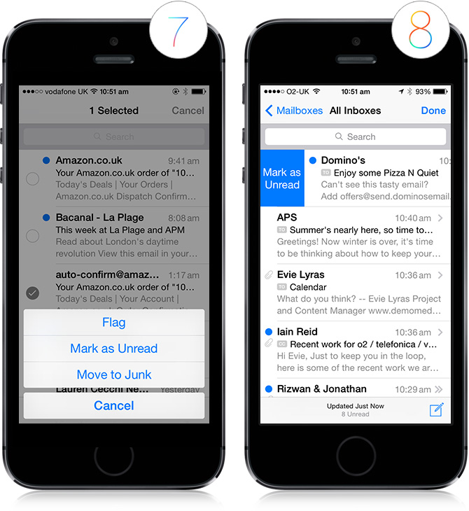
Within your inbox, when you swipe to the left, iOS 8 gives you the option to “Flag” the message in addition to the iOS 7 options of “Archive” and “More.” This is extremely useful for those of us who are hyper organised in our email categorisation as you can execute this action in one fell swoop…or swipe for that matter.
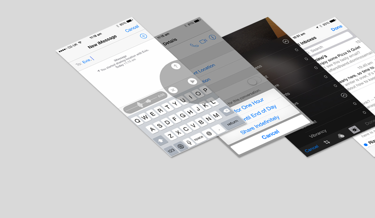
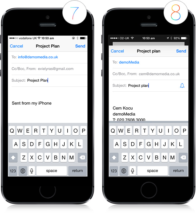
Clicking the “More” option on individual emails now entails the ability to “Notify Me” where you can set alerts for specific emails. You can also easily do this via the same subject line while you compose messages by simply clicking the bell icon within the subject line.
We love this feature in theory, however it does mean that the user will have to remember which specific conversations he or she has set alerts for, and one of the most commonly cited rules of good usability is to facilitate recognition over recall– or to make the user have to memorise the least amount of information possible.
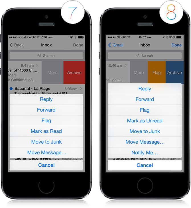
In order to mark an email as read, instead of clicking edit, selecting the email and choosing from a menu of several options (as was the procedure in iOS 7), all the iOS 8 user has to do is swipe to the right and the option to “Mark as read” appears in just one interaction step–that is commonly considered to be good usability practice in that it requires minimal effort to access and execute a commonly used feature. We anticipate using this new iOS 8 email feature regularly.
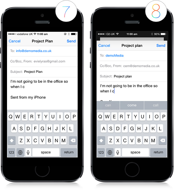
Say goodbye to damnyouautocorrect.com — iOS 8’s text prediction is on point, recognising not only the type of language you use when constructing an email vs. a text message, but also the language you use when communicating to certain people. We think this could be one of the best features of the new system as it embodies intelligent technologies executed in seamless UX design.
Photos
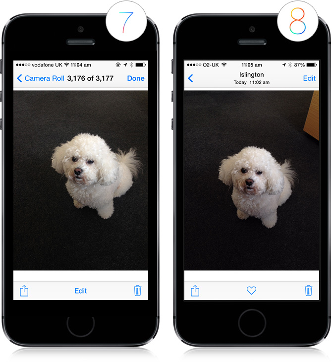
A small change, but when you view individual pictures within your photo albums albums in iOS 8, there is a section at the top that says exactly where and at what time the photo was taken instead of its number in the lineup of your camera roll (what was the point of that labelling anyway?)
Also in iOS 8, there is the option to “favourite” a picture, and the album title has been replaced with a simple arrow indicating backwards navigation. From a usability standpoint, this is an exercise in simplifying taxonomy. We love the simplicity of the display now, but wonder– is this lack of feedback and no clearcut breadcrumbs good usability practice?
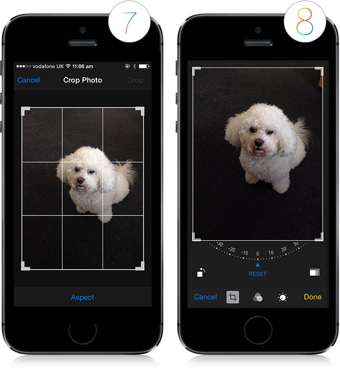
Editing photos in iOS 8 is much more extensive than it was in iOS 7. You now have the ability to tilt, adjust, apply layers, etc.– This is fantastic on the fly, but the integration of this feature could perhaps even replace some of your favourite photo editing apps.
Navigating between apps
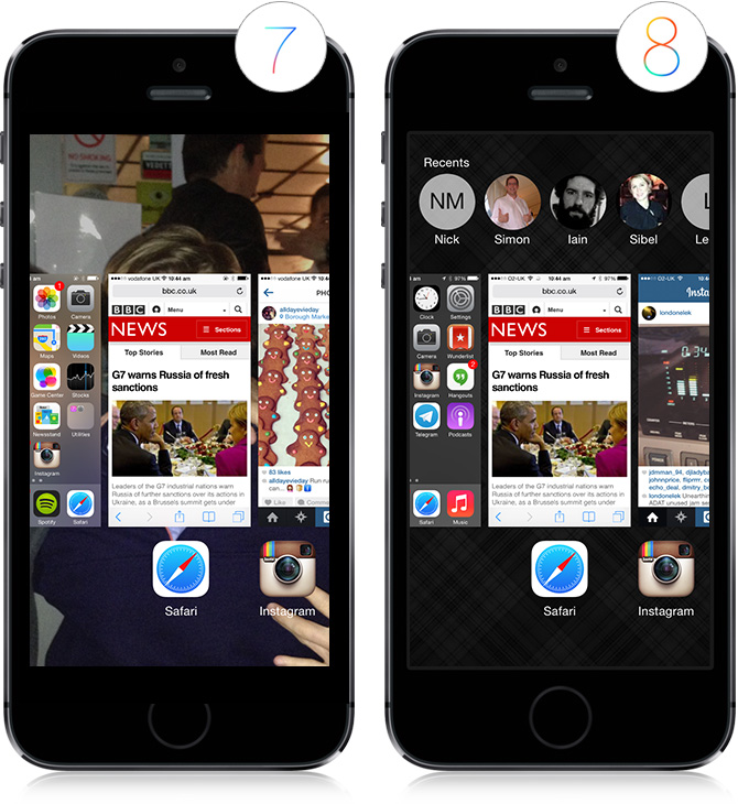
When you double click the home button to see all open apps, iOS 8 adds a banner to the top, providing easy access to your most commonly used contacts. We love this feature as it provides a personalised shortcut to something we use frequently. We would love to see Apple incorporate more of these types of specialised features into iOS updates to come.
At the end of the day, usability best practices are in place with the assumption that most people respond to and understand interfaces in a similar way (based on frequently used design conventions, the evolution of operating systems, the way we naturally think and act outside of a computer-based interaction process). But within those broader categories, all users are inherently different, and the actions I commonly take on my iPhone are different from those that another user frequently takes.
In the future progression of iOS updates, I would like to see more personalisation and Apple’s intelligent data collection about the way I work and use my devices employed in a way that best suits me specifically rather than applying a blanket assumption over all iOS users.


4 Comments
Cem
After having spent a week or so using iOS 8 now I have to admit to being a little perplexed. Firstly, this is the first time Apple have exposed a new release to their iOS where there has actually been very little difference. I struggle on occassion to notice any key changes that affect the way I use my phone, again another first for Apple.
Of all the features listed above which we felt was originally the most exciting, I have to admit to having used none of the functionality.
Perhaps having a quick access to the archiving of emails is the most useful, but hardly enough to constitute a whole new version release?
Cem
Never have I witnessed a Beta release so unreliable from Apple before. It was very unstable and quite unlike any of their previous developer early access releases. I’ve subsequently uninstalled as it’s simply not good enough for real world use yet. Back to 7.1 again.
Eeshwar
I agree with Cem there has been little change for front end users, certainly not enough to warrant a new version release. However, the main changes are for developers. Not only have they added over 4000 new APIs, they have also released a new programming language.
Swift is said to perform much better, I’m curios to know if you guys have seen any performance differences.
Something else beta users will not have experienced yet is the customisation that is opened up to them thanks to the new APIs. I must say I was surprised to find out developers can now make keyboard apps and notification tray widgets. Im interested to see what people can come up with but I thought Apple would keep this locked down to stop people from potentially ruining the core looks of the OS.
Cem K.
Interesting to see how we have settled into the dramatic change Apple introduced with iOS8 exactly a year on from this post. I saw an iPhone running iOS 7 a few days ago and baulked at how ugly it looked. How quickly the paradigm shifts.