Flat user interface design is the current design trend, but do we need it?
WHAT IS IT?
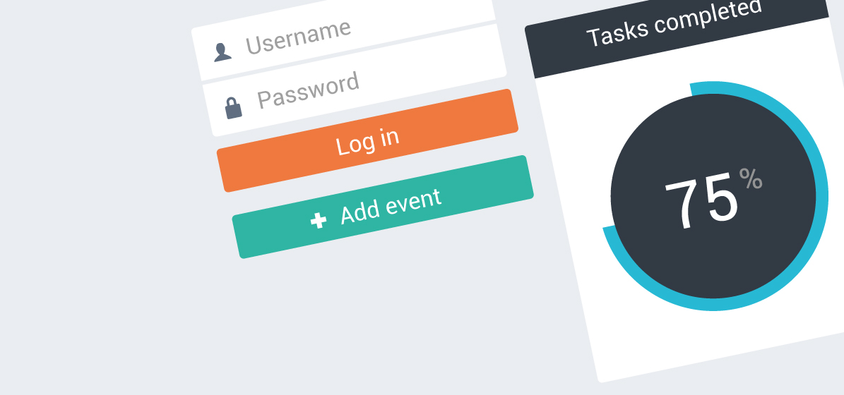
Put simply, Flat Design is shorthand for functional, modernist and minimal interface design.
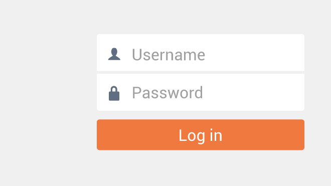
Advocates for Flat Design argue that GUIs should abstain style for functionality. That means using no heavy beveled edges, gradients, shadows, and reflections, as well as creating a user experience that plays to the strengths of digital interfaces, rather than limiting the user to the confines of the familiar analog world.
UI’s designed with a Flat mindset limits dimensionality, shadows, or textures in the design, relying instead on parallax scrolling and visual clarity to communicate. Some high profile examples of Flat design would be Windows 8, Android, and now, iOS7.
SKEUOMORPHISM
Skeuomorphism in digital design dates back to the early days of computing. Apple’s first consumer GUI, from 1984, introduced the concept of a “desktop” and graphical icons that tried to mimic their real world counterpart, and looked like folders and pieces of paper. I have written a previous blog post about the practice here.
In those days computer interfaces were a totally new and foreign concept to most users, which made skeuomorphism a valuable tool. It let designers create visual metaphors between old, familiar objects and a new, confusing tool. Skeuomorphism helped us to learn how to use these new devices by making it easy for us to understand the function.
Fast forward to today, we dont need to learn how to use digital products, because they have been around for 35 years.
Everybody knows how to use a computer. So the need to hand hold the user digitally is no longer there, rendering Skeuomorphic design superfluous.
BENEFITS
Flat design is beautiful and refreshing. It’s also generally faster to design and easier to make responsive. Load times are improved, which is a plus point especially with responsive, serving multiple devices. It is pure, and ensures the content is the focal point, not the fluff surrounding it.
Old hat usabliity ‘experts’ Neilson Norman Group have acknowledged Flat GUI’s visual freshness, and typographic style. Although as with anything new, have branded Windows 8 as having ‘Disappointing Usability’, partly down to Flat UI. Missing the point entirely, they comment on users not knowing which areas are ‘clickable’, or ‘tapable’ in this case, as Windows 8 was designed for mobile, as well as desktop.
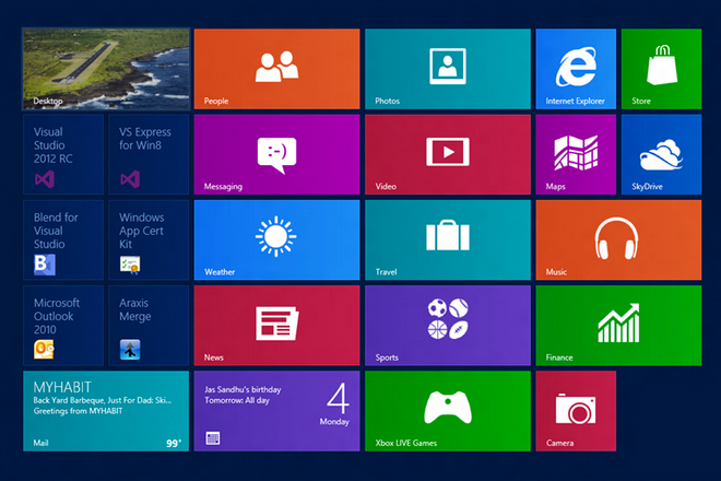
One trait across Websites and Operating Systems using this design approach is Low Information Density. Large images, large typeface sizes and lots of white space feature commonly, which has given away to some truly beautiful, photography led layouts.

ALMOST FLAT DESIGN
Purist flat design, including no gradients, bevels or designed elements at all, are actually rare. Windows 8 is flat, for example. What is more common, is very flat UI’s with some design elements, such as subtle gradients. An example of this would be Google Mails new interface design. There are gradients, and some shading, but the majority of the interface is flat.
Expect to see this trend continue, and many more beautiful flat designs.
