Time to brick my phone again.
It’s been a few days since the launch of the developer early access beta to iOS6.0. Apple boast around 200+ improvements and features and I’ve been able to spend some time going through the main changes.
Thankfully, this early release appears to be a lot more stable than the v5.0 beta I played around with almost exactly a year ago. It’s still early days and I have been forced to quit applications a few times to get them running smoothly. I’ve also had to reboot my device once as the context sensitive text editing functions weren’t working. Otherwise it’s very stable.
Installation was a little problematic. I interrupted the sync of all my apps half way through as I had to dash from the office, expecting to be able to continue the downloads at an available wi-fi spot later, but it didn’t work. I had to delete a number of sync items and try again.
The most significant announcement is the decision to drop Google as the maps provider. From what I’ve read, there’s practically an aerial battle going on with fleets of Google and Apple aircraft vying for supremacy as they all rush to capture as much map data as possible. Initial impressions are mixed. I liked the fact that they used Google, simply because it meant there was no single giant entity who controlled everything. However, Apple have seen how Google monetize the maps, they simply wanted a piece of that pie.
Initially, the map is slow to load. It takes a few seconds to position itself, but after that it’s pretty quick to update, refreshing map blocks efficiently. Maybe this is down to smaller block images as they lack some of the detail you find on the Google version. Street names don’t all appear until you zoom right in.
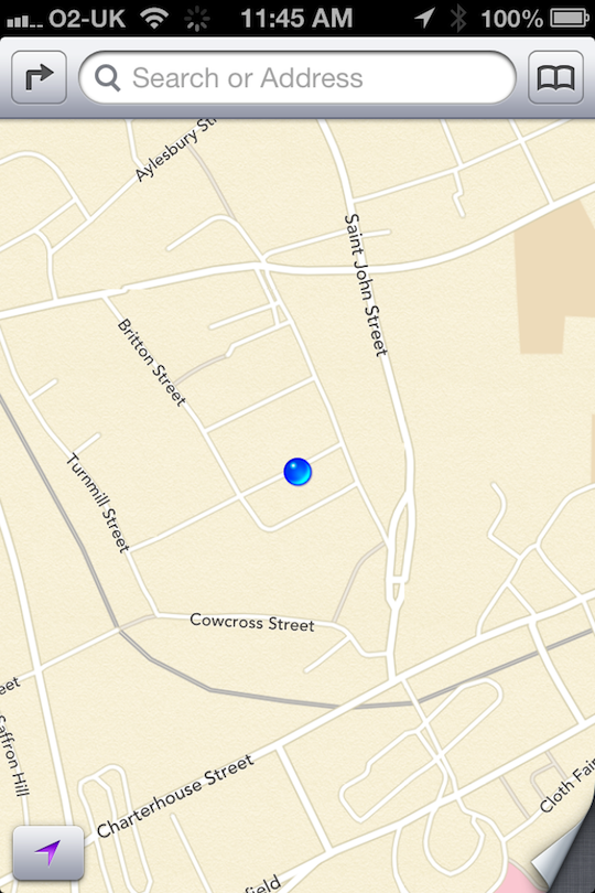
There is the new “Recent’s” which allows you to quickly locate a previously searched location.
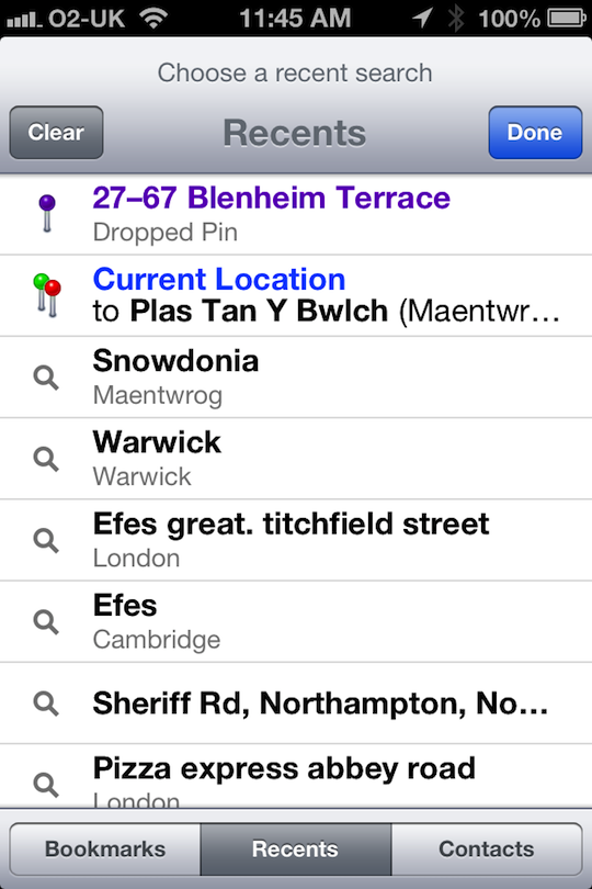
As you can see the map has a different design now. I think it looks a lot purer. For some reason I couldn’t get the new 3D maps working.
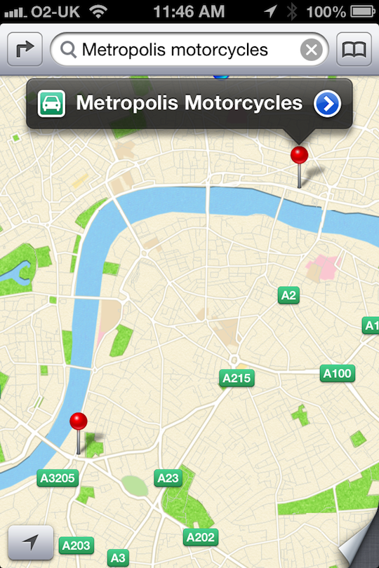
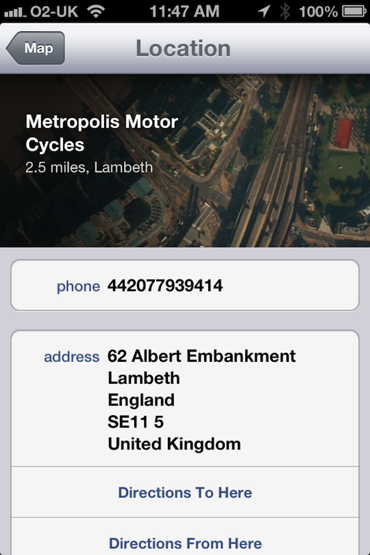
Clicking on the location pin now gives you a more visual address page:
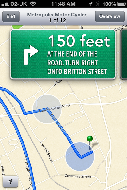
Also, comes with turn-by-turn navigation. I will be trying this out on the car soon, to see if it’s good enough to replace Nav-Free which I use.
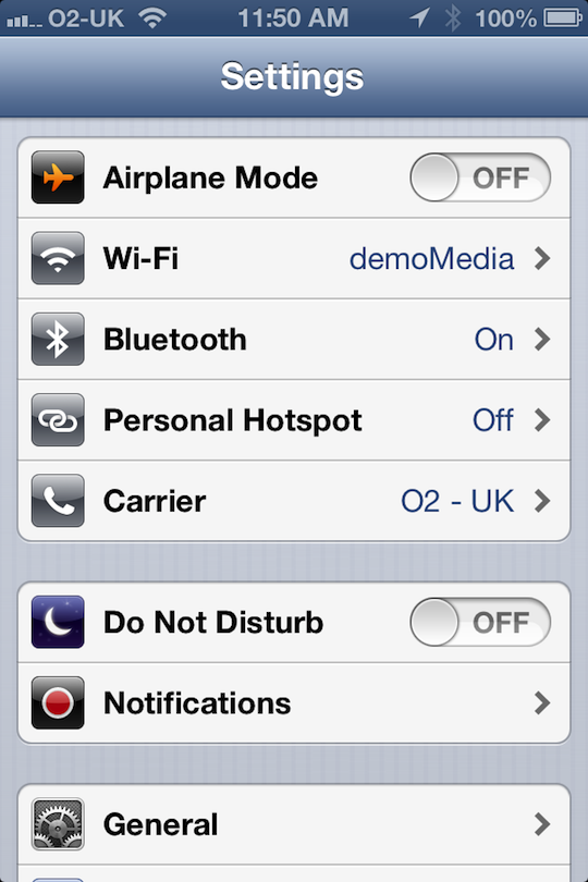
Settings screen has been modified. On the iPad too, it is categorised much better. Some settings are options that I’ve been crying out for, such as account specific email signatures. The blue-tooth option is now further up the settings page, which is good for those of us who like to conserve battery and have it on and off.
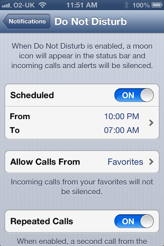
Do not disturb feature is a neat trick, allowing you to go silent during hours you don’t want your phone ringing.
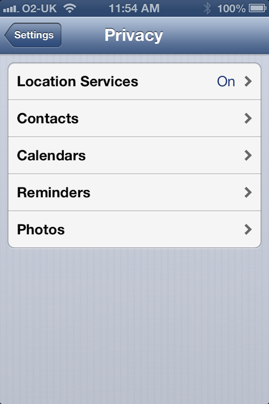
Privacy settings allow you to specify, on an app by app basis, which programs get access to which core iPhone features, such as camera reel and contacts.
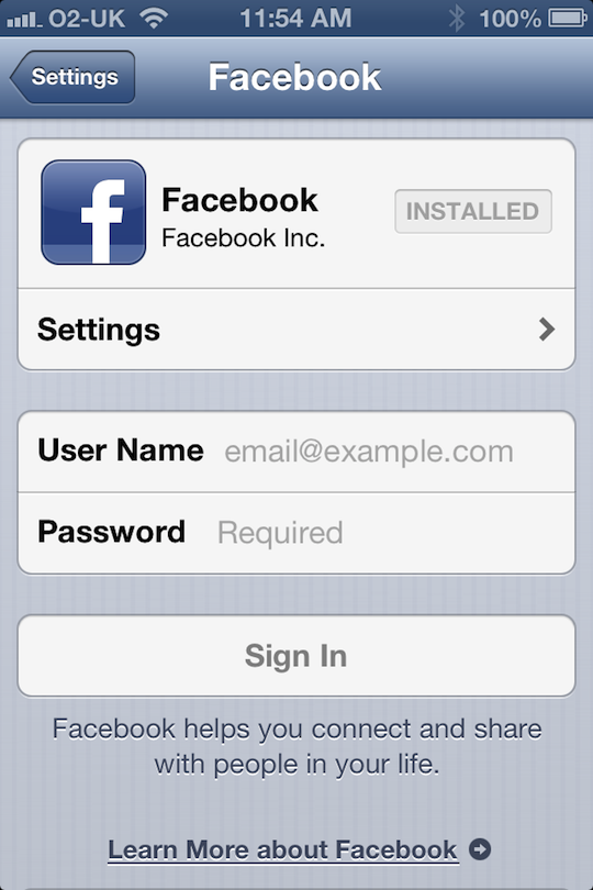
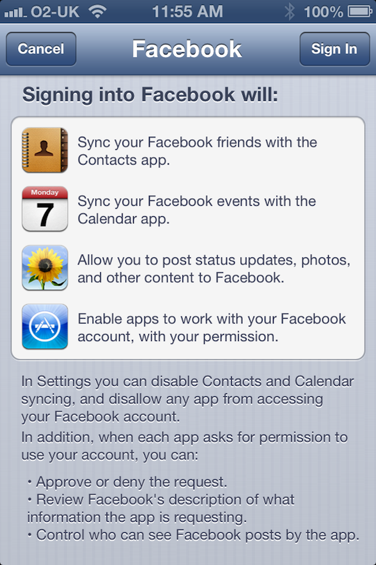
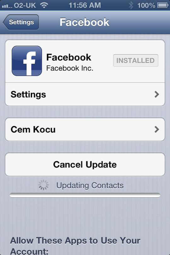
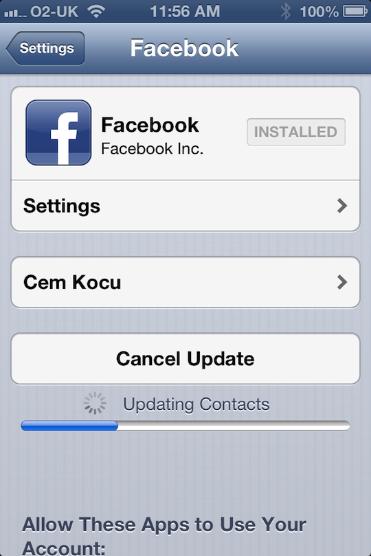
Facebook integration is another big thing. It’s a very small piece of functionality really, but so blindingly obvious in its absence, it’s a massive surprise it didn’t make it in at the same time as Twitter came on to iOS5 a year ago. I can almost guarantee there were political reasons behind that!
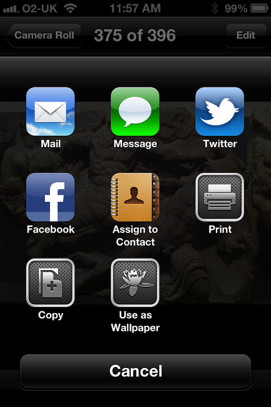
The Photo reel now has some added sharing functions. This has necessitated a redesign which I feel looks a little clumsy at the moment. The camera app has also been redesigned, with a black and dark grey button.


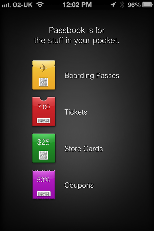
Passbook, an interesting concept, is no doubt an app in preparation for the next iPhones possible inclusion of NFC. Currently it doesn’t work.
So far, the best part of iOS6 is the new call answering options. When the phone rings, you get the usual slide to answer, but you also get a new icon where the Camera quick launch app used to sit:


Sliding this new icon now presents you with four options. Answer, Decline, Reply with Message and Remind me later.

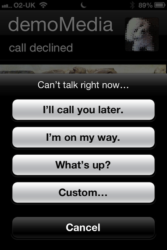
First is “Reply with message”. This is fully customisable and you can edit your options in the settings. Choosing one of these options immediately sends a text message to the caller with your chosen message whilst rejecting the call at the same time.
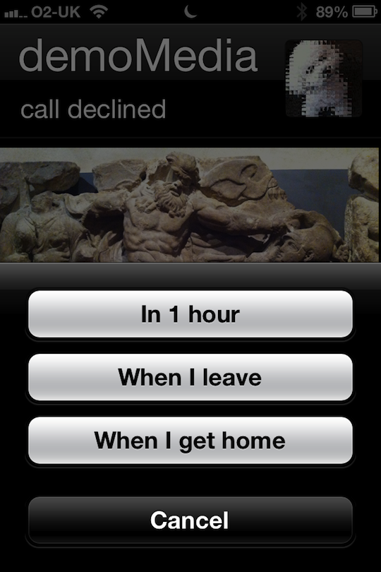
The other new option is to Remind you later. This gives you an alert to call someone back on either time or geographic call to action.
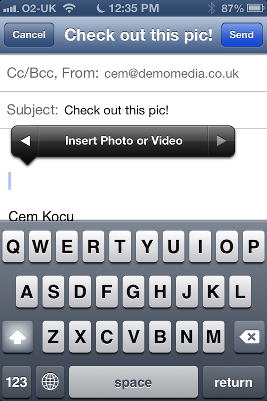
Email fills an important gap in editing by allowing you to pull in photos direct from the email app and paste them into the email. This is achieved through the context sensitive menu options.
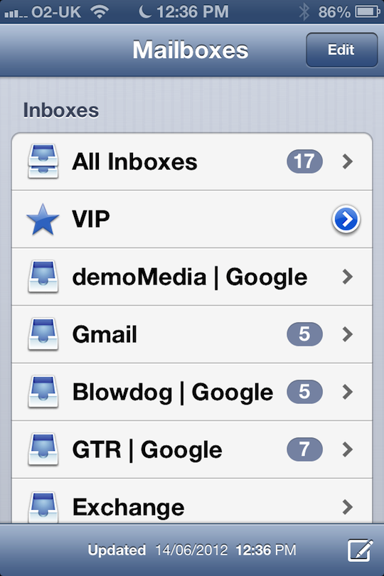
Together with this new function, you’ve also got the new VIP filter. You can add anyone you want from your contact list as a VIP, with this subfolder pulling any emails from those contacts.
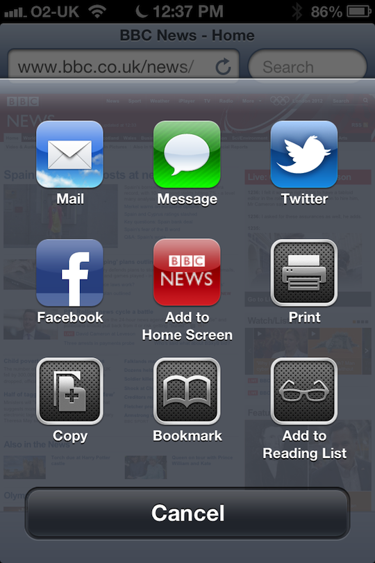
New Safari on iPhone now allows you to both share via Facebook and Text message. These are great new features.
Also, whilst browsing in landscape mode, you now have the option to go full screen with the two arrows on the bottom right of the tool bar. This removes all toolbars, allowing you to enjoy more screen estate.
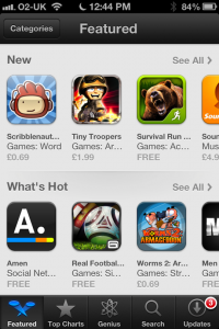
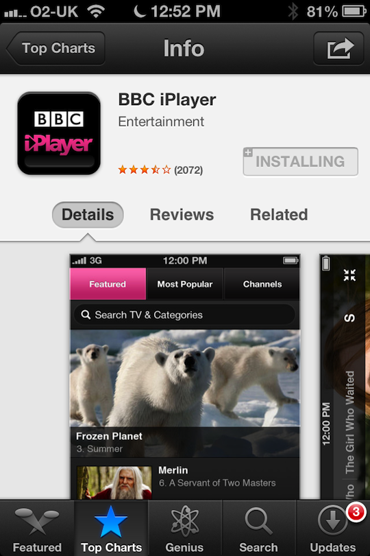
The App store has been completely redesigned. It doesn’t look as punchy as before with the missing featured items as large thumbnails.
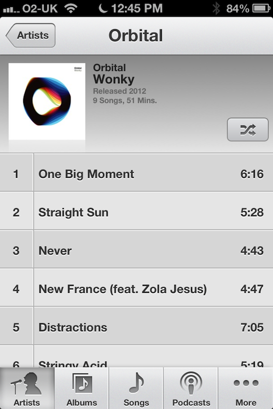
The music app has been totally redesigned. It looks great, with nice bold text.

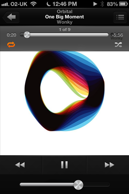
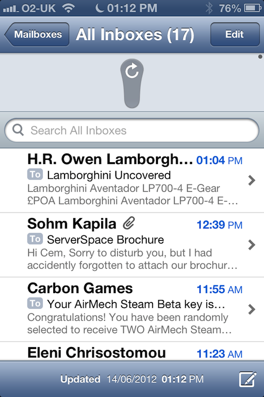
The little circular metallic knobs now glisten and shine when you tilt the iPhone. A neat touch that goes some way to demonstrate Apple’s insatiable appetite for detail that only 0.001% of it’s users will ever notice. Another one of these details is the way you pull to refresh your email, the refresh icon stretches and snaps, like an elastic band – delightful.
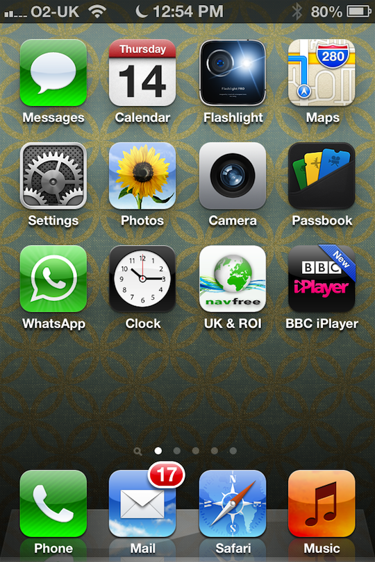
Buying a new App from the store now highlights the new app with the ‘New’ banner across the icon on the dekstop.
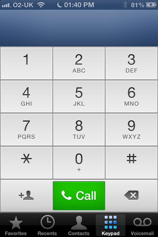
Finally, another redesign of the phone apps keypad. This follows the new font styles and colours, combined with the new blue banner across the top of some of the apps (used to be black) it gives it a very slightly different tone.
So far, although there appear to be a number of great additions, I’d be hard pushed to call this a complete new release. More like a 5.5 than a 6.0. Still, I’d like to start using this on an iPhone 4S or even a 5, to see the improvements made to Siri. I really want Siri to work. It’s an incredible concept and the amount of times I find myself wanting to type a text message in a car is dangerous.
I’ll be looking into the changes to the iPad soon.


